Check out 3 major benefits of responsive e-learning course design and learn how to create responsive learning courses with ActivePresenter here in this article.

Over the years, more and more e-learning professionals consider to create responsive e-learning courses for their customers because of its uncountable benefits where we come in today. By creating a responsive course, you can save tons of your time and offer more choices for your learners. Before we go, let’s figure out what is a responsive e-learning course first.
Responsive e-learning course is a course that was created to be able view on any devices such as laptops, tablets, smartphones or web browsers. This means learners can view the course anywhere and anytime they want. In order to create such courses, you’ll need a powerful e-learning authoring tool that lets you configure responsive layouts like ActivePresenter, Adobe Captivate or iSpring Suite. That’s not to mention some other cloud-based authoring tools available on the market now.
Here are 3 major benefits of responsive e-learning course design
1. Save your time and money
Creating e-Learning course is a time consuming work whether you work in a team or just one-person-band. Traditionally, you have to build many versions of your course with the same content. Whenever you want to update or change something, you must do the same on all versions. When it comes to responsive learning course, you’ll only need to create one version with a single design effort, and have your course working on any devices. It would be easier for you to update or change your content rapidly.
2. Offer more choices for your learners.
Learners are always the most important factor you need to consider in creating learning courses whether you agree or not. They are the key to your course success. With responsive content, learners will have various options to access your courses so long as they have their smartphone or tablet with them. They can learn from home, on bed, at coffee shop or any where that they feel comformtable.
3. Increase audience reach and course completion rate
When learners have more options to access your courses, the chance they can complete the course will increase. Because learners can open the training course anytime and anywhere, they can choose to fill in their busy timeline by watching the course when they are waiting for plane at the airport or sleeping time.
So you know some benefits of responsive e-Learning course design now. Before you begin, let’s take a look at how to create responsive courses with ActivePresenter from this short tutorial.
How to create responsive e-Learning courses with ActivePresenter?
Firstly, you’ll need to download and install this authoring tool on your computer. It will take about 5 minutes from start to finish.
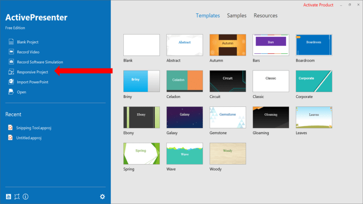
Let’s start by click on Responsive Project
Now you can choose one of five default layouts manually as below:

- Desktop with the viewport of 1280×620
- Tablet Landscape with the viewport of 1024×674
- Tablet Portrait with the viewport of 768×930
- Mobile Landscape with the viewport of 667×345
- Mobile Portrait with the viewport of 375×522
If you don’t want to choose default layouts, it is possible to Add a responsive layout yourself.
To learn more about this authoring tool, I suggest you read this operation manual file to know how to use it before you go.
Bottom line
We hope the above information is helpful to you. Don’t forget to follow us to receive more valuable post notifications in the future. Elearning Supporter is your trusted place to find honest review about elearning authoring tools, video editors and screen recorders for free and business use.
Good luck!
 Elearning Supporter
Leave a comment